Tutorial: Web Maps and Apps
In this tutorial, you will learn how to create a Web GIS app that presents the spatial patterns of US population change, explore the reasons behind the patterns, and share what you found with the public using an ArcGIS StoryMaps story. In the process, you will learn the skills to create a feature layer using geocoding, style your layer using smart mapping, configure layer pop-ups using ArcGIS Arcade, and create an ArcGIS StoryMaps web app with various types of content blocks.
Data: You are provided with a CSV file, Top_50_US_Cities.csv, which contains the 2010 to 2020 populations of the 50 most-populated cities in the United States. Several images are provided for use in the story.
*Adapted from Getting to know GIS (Pinde Fu, 5th ed.)
Sections:
- 1: Create a feature layer – using geocoding
- 2: Configure layer style using smart mapping
- 3: Configure layer pop-ups using ArcGIS Arcade
- 4: Add images and charts to your layer pop-ups
- 5: Create a story
- 6: Work with swipe blocks and express maps
- Questions and answers
- Assignment
- Resources
Functional requirements:
- Your map symbols should be easy to understand.
- If a city or region is clicked, your app should display associated details in intuitive ways.
- Your app should present the population change patterns and the reasons behind the patterns in story format.
2.1: Create a feature layer – using geocoding
In this section, you will use geocoding to create a hosted feature layer from a CSV file.
-
Fetch the data used in this exercise here, and unzip the downloaded file to a folder on your local machine.
-
Open the
Top_50_US_Cities.csvfile in Microsoft Excel or a text editor and study the data fields.There are no latitude and longitude fields in the CSV file. The file contains the following fields:
- Rank: A city’s rank by population
- City: City name
- State: Name of the state in which the city resides
- Census2010 and Census2020: City population as of April 1, 2010, and April 1, 2020
- Estimate2012, Estimate2014, Estimate2016, and Estimate 2019: Estimated population as of July 1 in those years
- MHHIncome2019 and MHHIncome2021: Median household income in 2019 and 2021
- MHomeValue2019 and MHomeValue2021: Median home values in 2019 and 2021
- Wikipedia_URL: URL to the city’s Wikipedia page
- Picture_URL: URL to an image of the city’s seal or flag
Note: The household income and home value figures were calculated based on 20-mile buffers using the ArcGIS Online Enrich Layer tool.
-
Close Excel or the text editor.
-
In your web browser, go to Duke’s AGOL portal (https://dukeuniv.maps.arcgis.com) and sign in.
-
Create a new folder called
Tutorial2to hold resources for this exercise. -
Add the
Top_50_US_Cities.csvto this folder and as a hosted feature layer.- Be sure to add your name, NetID, or something else to ensure this object name is unique within Duke’s portal.
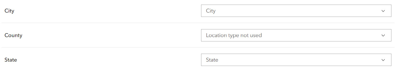
- On the Location settings page, notice the type of location information selected is Addresses or Place Names. Under Location fields, choose Location Information Is in Multiple Fields. Ensure that City Location Type uses the City field and State uses the State field.
This CSV file does not have latitude or longitude fields. ArcGIS Online will geocode your data. Geocoding converts addresses and other identifiers (such as place-names and postal codes) into coordinates. If ArcGIS Online doesn’t pick up the correct location fields, you have the option to click the location fields that you think are wrong and change them.
-
When prompted with the Review Locations option, click No.
With the tutorial data, all cities are matched to their correct locations. If you choose Yes, your feature layer will be added to Map Viewer for you to review the geocoding results.
►Next, you will change the display names or aliases of several attribute fields to make them easier to read.
-
On the item page, click the Data tab, and click the Fields tab.
-
In the Display Name column, click MHHIncome2019.
-
Click the pencil icon to the right of
MHHIncome2019.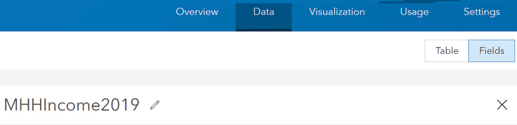
-
Set the display name to
Median household income 2019, and click Save. -
On the left side, click the MHomeValue2019 field, edit its display name, set it as
Median home value 2019,and click Save. -
Click the Overview tab, click the Share button, select Everyone, and click Save.
You have created a hosted feature layer using geocoding and configured its field aliases.
2.2: Configure layer style using smart mapping
You can configure layer styles in Map Viewer or on the Visualization tab of the layer item page. This tutorial will use Map Viewer.
-
On the item page of your new feature layer, click Open in Map Viewer.
-
Set the basemap to Light Gray Canvas.
-
On the Content toolbar, click the Layers button.
-
In the Layers pane, click the Top 50 US Cities layer to select it.
-
On the Settings toolbar (on the right), click the Styles button to display the Styles pane.
This layer is displayed using the Location (single symbol) style by default.
-
In the Styles pane, under Choose Attributes, click Add Field (plus sign), choose Census2020, and click Add.
Smart mapping automatically selects Counts and Amounts (Size) as the default style for this numeric field. You can symbolize points, lines, and areas using this approach. The proportional symbols make the map intuitive. On this map, can you distinguish which are the top two most populated cities in the United States?
►Next, you will style the layer based on the ratio
Census2020andCensus2019using the Color and Size style. It will allow you to style two attributes intuitively. -
In the Styles pane, click Color and Size, click its Style Options button, and apply the following settings:
- For Theme, choose Above and Below.
- For Divided By, choose Census2010, and click Add.
- For Symbol Pair, choose Arrows.
- For Below, choose a blue shade, and for Above, choose a red shade.
- On the histography, drag the middle divider to 1, or click the number and type 1.
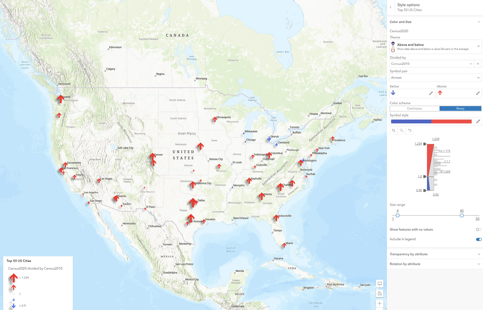
The map now displays the ratio of population from 2020 to 2010, which is a good indicator of population change over the years. Upward arrows indicate increases while downward arrows indicate decreases. Bigger arrows indicate bigger increases or decreases, and smaller arrows indicate smaller increases or decreases. A value of 1.0 means there was no population change; numbers greater than 1.0 indicate population growth; and numbers less than 1.0 indicate population decline. This ratio is a good approach to reveal how things change over time without having to create multiple maps. This approach works for any numerical data from two time periods.
You may also change the Min and Max symbol sizes and adjust the two handles on the histogram slider to exaggerate the cities with the most and the least population growth.
-
Click Done to close the Style options pane.
-
Click Done again to close the Styles pane.
►Next, you will configure the effects on your map. Effects bring graphic software-like authoring capabilities to your layers. Effects can be applied to point, line, and polygon layers.
-
On the Settings toolbar, click the Effects button.
-
In the Effects pane, click Drop Shadow.
-
In the Drop Shadow pane, apply the following settings:
- In the Offset quadrant, click and drag the dot to set X-offset to –7 and Y-offset to 7.
- Set Opacity to 50.
- Notice the shadow effect applies to the symbols immediately.
-
In the Effects pane, click Saturate.
-
Set the strength to 200. Notice the appearance change of the symbols.
►Next, you will zoom to a desired map extent and save your web map.
-
Click the X button to close the Effects pane.
-
Zoom your map to show all 50 cities.
Once you save your web map, the current map extent will be the initial or default extent of your web map.
-
On the Content toolbar, click the Save and Open button, and click Save As to save your web map.
-
Set the title to
US Population Change, set tags toENV790andTutorial2, and save the map in the Tutorial2 folder.
You have configured the style of your feature layer. With the style, you can see which cities had population increases or decreases.
2.3: Configure layer pop-ups using ArcGIS Arcade
In this section, you will decide what information to show and how you will show the information in the pop-ups for the cities. If you closed your web browser from the previous section, find the web map in the Tutorial2 folder of your content, and open it in Map Viewer.
-
Click one of the 50 cities to see the default pop-up.
This default pop-up is useful, but you can enhance the window to communicate information in more intuitive and engaging ways.
-
If the Top 50 US Cities layer is not selected, click it to select it. On the Settings toolbar, click the Pop-ups button.
►Next, you will configure the title to be a set of attribute field values.
-
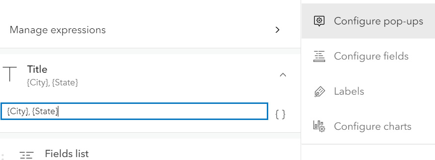
Click Title, delete the default title in the text box, and do the following:
-
Click the braces button
{ }next to the title text box and select theCityfield to add it. -
Type a comma and a space.
-
Click the braces button
{ }again to add theStatefield.
►Next, you will configure the pop-up contents, which can be a list of attribute fields and Arcade expressions or a custom description based on the attribute fields and expressions. You will first build an Arcade expression.
-
-
Click Attribute Expressions, and click Add Expression (plus sign).
The expression editor window appears.
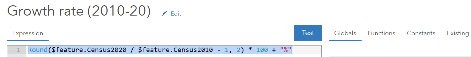
Next, you will build the expression
Round($feature.Census2020 / $feature.Census2010 - 1, 2) * 100 + "%", which calculates the percentages of population growth from 2010 to 2020 for each city and rounds the result to two decimals. A value of 0% means no population change, a positive percentage means population growth, and negative percentage means a decrease. Arcade is more than a simple equation. It’s a scripting language. For example, the expression you just built can be written as the following:var a = $feature.Census2020/$feature.Census2010 - 1; var b = Round(a, 2) * 100 + "%"; return b; -
In the expression editor, do the following:
- Next to the default title, Custom, click the Edit button, and change the title to
Growth rate (2010-20). - Click in the Expression text area.
- Click Functions and search for
Round. Click Round to add it to the expression. - In the Expression area, remove any text between the parentheses.
- Click Globals (“
(x)”, click the greater-than arrow (>) next to $feature, find and click theCensus2020field, press the slash key (/), and find and click$feature.Census2010. - In the Expression area, type
–1,and then add a comma followed by the number of places to round: 2. - After the closing parenthesis, type
*100 + “%”. - Click Run to verify that the results look correct. If not, correct the expression based on the error message.
- Next to the default title, Custom, click the Edit button, and change the title to
-
Click OK.
-
Click the back button to the left of Attribute Expressions to return to the Pop-ups pane.
►Next, you will configure the attributes and expression to display in the pop-up. Some of the fields already appear in the title, and others will be displayed in charts and image links. Thus, you can hide them from the attribute list to make your layer pop-up simple and clear.
-
Click Fields List, and click Select Fields.
-
Click Select All so that the button says Deselect All. Click it again.
-
In the field list, select Rank, Growth Rate (2010-20), Median Household Income 2019, and Median Home Value 2019.
Note: The order in which you select these fields determines the order in which they appear in the pop-up.
-
Click Done.
-
Click any city on the map to review the new pop-up.
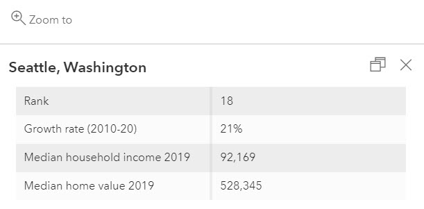
The pop-up window is now simpler and easier to read than the default pop-up. The pop-up also includes the custom expression you built with Arcade.
-
Click the Save and Open button on the Content toolbar. Click Save to save your web map.
2.4: Add images and charts to your layer pop-ups
Media, such as images and charts, can more effectively engage users and improve their understanding of your data.
The tutorial CSV file contains two URL fields: Picture_URL and Wikipedia_URL. You will use the first URL to add a picture to the city layer’s pop-up and the second URL to link the picture with the city’s Wikipedia page so that users can gather supplementary information about the city’s population changes. Charts require numeric attribute fields. The US cities layer contains several of these fields. You will display them in appropriate charts to exemplify the population trends of the cities.
If you closed your web browser from the previous section, find the web map in the Tutorial2 folder of your content, and open it in Map Viewer. From the layers list, select the Top 50 US Cities layer, and click Pop-ups.
-
In the Pop-ups pane, click the Add Content button, and click Image.
-
In the Configure Image window, apply the following settings:
- For URL, click the braces button { } and click the
Picture_URLfield. - For Title, type
About the city. - For Link, click the braces button { } and click the
Wikipedia_URLfield.
- For URL, click the braces button { } and click the
-
Click Done to close the Configure Image window.
The image title, caption, image URL, and link URL can all take the form of static text, attribute field values, or a combination of the two. If you do not have image and link URL fields when you do the assignment, you can specify a static URL instead. For example, you can use http://www.census.gov/history/img/Census_Logo.jpg as the image URL and http://www.census.gov as the link URL. This way, the pop-up windows for all cities display the same image and link to the same web page.
-
Click a city on the map to observe the new pop-up.
The pop-up window displays the city’s seal or flag. If you click the image, the city’s Wikipedia page appears.
►Next, you will add a chart to the layer pop-up. You can add the chart to the same section as the image or to a new section. Here, you will add it to a new section.
-
Under the Media section, click Add Media, and click Chart.
-
In the Configure Chart window, keep the bar chart selected, and apply the following settings:
-
For Title, type
Population Change (2010–2020).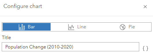
-
Click Select Fields, select the Estimate or Census population fields of 2010, 2012, 2014, 2016, 2019, and 2020 in order. [Note that the order of selection will determine the order in the chart.]
-
-
Click Done to close the Configure Chart window.
-
Click a city (for example, Detroit, Michigan) to see the new pop-up (use the Search box to find Detroit and other cities if you don’t know where they are).
In the pop-up, you can see the attributes, the city seal or flag image, and the chart you configured. The chart makes it clear that the population of Detroit has been decreasing.
-
On the Content toolbar, click the Save and Open button, and click Save to save your web map.
-
On the Content toolbar, click the Share a Map button to share your layer with everyone, and click Save.
The new pop-up you configured does more than display raw attribute values. The pop-up uses the URLs stored in the attributes to display and link a picture to a website that provides additional details. The pop-up also charts the numeric fields to provide a visual interpretation of population changes.
2.5: Create a story
In this section, you will create an app to showcase the US population change pattern and explore the reasons behind it. For convenience, a web scene, a web map, and several images are provided to you.
-
In a web browser, go to ArcGIS Online and sign in. If continuing from the previous section, in the upper left, click the Home button, and choose Content.
First, you will locate the web scene provided to you and add it to your favorites.
-
On the top menu, click the search button, and type samples chapter2 owner:gtkwebgis5.
-
Under Filters, turn off the Only Search in
toggle button. In the search result, find the two sample items. Click the Add to Favorites button on each item. 
Adding content to My Favorites helps you locate this item in the ArcGIS StoryMaps builder.
►Next, you will create a story app.
-
Click the app launcher (the icon of 3 x 3 dots in the upper right) and choose ArcGIS StoryMaps.
The ArcGIS StoryMaps home page appears.
-
Click the New Story button, and choose Start from Scratch.
You will first configure your story cover.
-
Set the title of your story to
Story of US Population Change. -
In the upper right of the page, click the Add Cover Image or Video button, browse to the materials you downloaded for this exercise and select
CoverImg.jpg,and click Add. -
On the top menu, click Design.
-
Under Cover, click Full.
-
Under Theme, select Ridgeline or a theme of your choice.
-
Click the X button to close the design pane.
►Next, you will add a heading and a video.
-
Scroll down past the title and click the Add (+) button. In the block palette, choose Text.
-
Type
US population has always been changing…. -
Select the text and change the style to Subheading.
-
Point under the text, and click the Add button. In the block palette, choose Video.
-
On the Add a Video dialog box, click Link, type
bit.ly/2TGeBDY, and click Add.This URL links to a YouTube video. Feel free to try a different video URL. You can use videos from YouTube, Vimeo, and other platforms.
-
Point to the video and choose the Large button on the toolbar.
The embedded video now occupies the full width of the browser window.
►Next, you will add a sidecar block.
-
Scroll past the video and click the Add button. In the block palette, choose Sidecar, choose the Docked layout, and click Done.
-
In the main panel, click Add Media, and choose Add Map.
The Add a Map window appears. By switching between tabs, you can choose your own web maps, maps that are shared with you, maps in your favorites, or maps from ArcGIS Living Atlas. Here, you will use your own web map.
-
Under My Maps, find and click the
US Population Changeweb map you created earlier.Your map opens. You can adjust the map appearance—for example, set the zoom level, extent, and layer visibilities. These changes are saved in the story without affecting the original map.
-
Apply the following settings:
- Zoom and pan the map to show the 50 cities in the view.
- Click the Options button and enable Legend.
- Click the Place Map button.
The map is placed in the media pane.
-
On the narrative (left) side, click the Add button, choose Text, type
Not all areas change in the same way, select the text, and set its style to Large Paragraph.►Next, you will add two map actions for users to zoom to Denver, Colorado, and Detroit, Michigan.
-
On the narrative side, point under the text, and click the Add button.
-
In the block palette, choose Map Action.
-
Click the default map action name and change it to
Denver Region.
-
Point to the Map Action button, and click the Edit button.
-
Zoom to the area of Denver, Colorado.
If you don’t know where Denver is, use the search tool to search for it.
-
Click Save Action.
-
Repeat the previous steps to add another map action. Set the button label to
Detroit Region, and configure it to zoom to the Detroit area. -
In the narrative pane, click the two map actions to see how they work.
-
Click the current map action to unselect it, which will zoom out to the default extent.
►Next, you will add two new slides to the sidecar and use them to display a simple 3D web scene.
-
Scroll down to see the bottom ribbon on the sidecar block. If it’s collapsed, click Expand to show the slide pane.
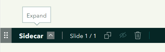
The one slide you currently have is represented by a thumbnail.
-
On the far right, click the Add button to add a new slide.
A blank slide is added. You will display a map on this slide.
-
In the media pane, click Add Media, and choose Add Map.
-
Click My Favorites, and click the Major City Population Change 3D scene.
-
Click Place Scene.
-
In the narrative pane, click the Add button to add the text
Visualize the changes in 3D.To explore the web scene, drag the left mouse button to pan, drag the right mouse button to tilt, and use the plus (+) and minus (–) buttons on the Navigate toolbar to zoom in and out. You will learn more about web scenes in chapter 7.
You have created a sidecar, which allows you to explore the different trends of population growth in different regions, in 2D and 3D.
Your story is automatically saved in draft mode. Keep the browser open to continue building your story. You will publish your story at the end of the next section.
2.6: Work with swipe blocks and express maps
In this section, you will use a swipe block and an express map to further explore the reasons people move and their patterns of moving.
-
Under the sidecar block, click the Add button, and choose Text.
-
Type
Why do people move?, and set the style to Subheading. -
Click anywhere under the subheading, click the Add button, and choose Text.
-
Type
Housing affordability is one of the influencing factors, and set its style to Large Paragraph. -
Under the text, click the Add button, and choose Swipe.
A blank swipe block is added to your story. Next, you will add web maps to each side.
-
Click the Add Web Map button to the left, choose the US Population Change web map you created, and click Place Map.
-
Click the Add Web Map button to the right, click My Favorites, choose the Major City Income vs Home Values web map, and click Place Map.
-
Point to the swipe block, and click the Large button to make the swipe block fill the width of the screen.
-
Point to the swipe block again, and select the Options button on the toolbar.
-
In the Swipe Options window, select Legend, ensure that both web maps are selected, and click Save.
-
Click the Legend button at the lower left to display the legend. Review the legends for both maps.
For more details on how to configure relationship map styles, refer to the “Questions and Answers” section.
-
Point to the vertical dividing bar, and click and hold it to drag it to the left and right. Review the relationships between patterns of population change and housing prices.
You can click the Expand button to maximize the maps. The swipe comparison shows higher population increases in many states with lower housing prices, such as Texas, North Carolina, and South Carolina.
►Next, you will create an express map to highlight the impact of the COVID-19 pandemic on why people move.
-
Scroll down, click the Add button, and choose Text.
-
Type
The trend of working from home during the pandemic allows more people to move to states with larger and more affordable houses, and set its style to Subheading. -
Click anywhere under the text, click the Add button, and choose Map.
-
In the upper right, click the New Express Map button.
-
On the Edit Express Map page, click the Options button, and change the basemap to Community.
-
Zoom the map to the continental US.
-
On the top toolbar, click the Draw an Arrow tool .
-
On the map, draw a line from anywhere in California to anywhere in Texas. Click the midpoint of the line, and drag it to make the line curve. Click the color button to make the line blue.
-
Similarly, create a blue curved line from anywhere in New York to anywhere in North Carolina.
-
On the toolbar, click the Text button, click anywhere on the map, and type
For example, moving to Texas and North Carolina but working for other states.
-
Click Place Map.
-
Point to the map block, and click the Large button.
►Next, you will add a chart to explain why people move.
-
Scroll past the express map block, click the Add button, and choose Text.
-
Type
People move for many reasons…, and set its style to Subheading. -
Under the text, click Add (plus sign), and choose Image.
-
Browse the
reasons-why-people-move.png, downloaded earlier and click Add.The pie chart image shows that people move because of housing prices, family, employment opportunities, and other reasons.
►As you were building your ArcGIS StoryMaps app, your work was saved automatically as a draft. Next, you will preview your app and publish it.
-
At the top of the page, click Preview.
-
Click the phone, tablets, desktop, and full-screen buttons to preview your app for different devices.
-
Click the X next to the device icons to close the preview.
-
On the menu bar, click Publish, set the share level to Everyone, and click the Publish button.
Your app is published and shared.
-
Click the Share button on the top to share your app to Facebook, Twitter, or LinkedIn, or copy the URL of your app and share it with your audience in other ways.
In this tutorial, you created a feature layer using geocoding; configured its style using smart mapping; configured its pop-up using Arcade; and added images, links, and charts to the pop-up. You then created an ArcGIS StoryMaps web app; embedded videos, images, web maps, and scenes; and configured sidecar and swipe blocks. These materials will help your audience understand the population change patterns and the multiple reasons behind those patterns.
Questions and answers
1. After I created my web app using my web map, I updated the layer styles and pop-ups of my web map. Will the changes be reflected automatically in my web app?
Answer: Yes. A web app maintains a link with its web map and depends on the web map as its source. Changes made to web map content, such as adding or removing layers, changing symbology, or configuring pop-up windows, will reflect automatically in the app.
2. CSV files can only hold point features. How can I create a line or polygon feature layer?
Answer: There are many ways:
If you have data in shapefiles or file geodatabases, you can zip the files in your shapefile or file geodatabase into one ZIP file (a shapefile is an Esri vector data storage format that contains .shp, .shx, .dbf, and .prj files, and a file geodatabase is a folder containing many files). Next, go to Content > Add Item > From Your Computer, browse to the ZIP file, and follow the instructions. If you have layers in your enterprise geodatabase, you can use ArcGIS Pro to publish them in ArcGIS Online or ArcGIS Enterprise. Refer to chapter 4, which covers how to create feature layers directly in ArcGIS Online. You can choose point, line, and polygon geometry types, as well as define your own attribute fields.
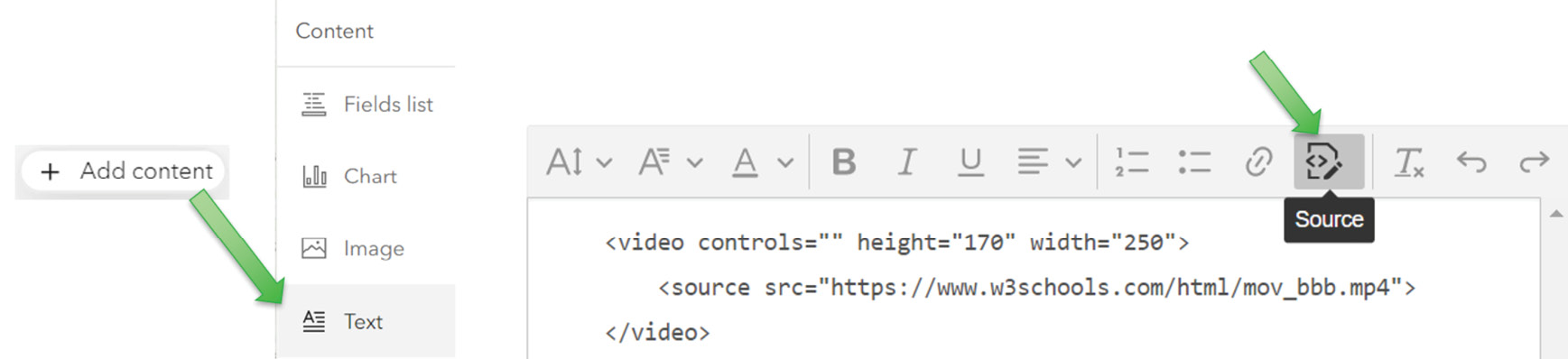
3. Can I insert video or audio clips into pop-ups? How?
Answer: Yes. Use HTML source as illustrated.
4. What is a predominant map, and how can I create a predominant map in ArcGIS Online?
Answer: A predominant map compares attributes that share a common subject and unit of measurement to see which has the highest value. For example, an election map can use it to display which one of two or more candidates won the most votes and by how much. When styling a layer in Map Viewer, choose two or more numeric fields and you will see Predominant Category style. Choose it and follow the instructions to create a predominant map.
5. The web map “Major city income vs home values” visualizes the relationship between household income and home values. How was such a map created?
Answer: The Relationship smart-mapping style can visualize the relationship between two numeric attributes in point, line, or polygon feature data. When styling a layer in Map Viewer, choose two numeric fields to see the Relationship style. Choose three number fields to see the Relationship and Size style. Choose one and follow the instructions to create a relationship map.
6. I added some points to an express map. Can I reuse the point layer in another app?
Answer: No. The points, lines, polygons, and labels you added in an express map are embedded (or hard-coded) in the map itself. No feature layers are created, so you can’t reuse them in another app.